Understanding Dulux, Hex, RAL Systems and Complementary Colours
Understanding Dulux, Hex, RAL Systems and Complementary Colours
 Colours play a significant role in our lives, influencing moods, evoking emotions, and enhancing aesthetics. In the realm of home design, specifically kitchen splashbacks, choosing the right shade is paramount. To assist homeowners, colour systems like Dulux, Hex, and RAL have been developed. But what are these, and how do they differ? Let’s unravel the mystery.
Dulux Colour System
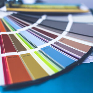
- Background: Dulux, a globally recognised brand, offers a diverse palette of colours tailored for home interiors.
- Features: Their system is user-friendly, categorising colours into families and tones, making it easier for homeowners to choose complementary shades.
- Usage in Splashbacks: If you have a Dulux paint shade on your walls, matching it to your splashback becomes a seamless process.
Hex Colour System
- Background: Hexadecimal (Hex) colours are primarily digital and are used in web design and graphic arts. It’s a six-digit combination of numbers and letters representing red, green, and blue (RGB) components.
- Features: With its vast array, almost any colour you can imagine is available in the Hex system.
- Usage in Splashbacks: If you’re looking to match or contrast your splashback with a digital design or brand colour, the Hex system can be invaluable.
RAL Colour System
- Background: Originating in Germany, the RAL system is widely adopted in architecture, construction, and industry. It comprises standardised colours for paints, coatings, and plastics.
- Features: With its systematic numeric codes, it offers precision, making it a favourite for professionals needing exact colour matches.
- Usage in Splashbacks: If you’re keen on consistency throughout your home or are matching an industry-specific shade, RAL offers clarity and accuracy.
Making the Right Choice
- Personal Preference: Your kitchen should resonate with your personal style. Whether you lean towards a Dulux’s earthy tone, a vibrant Hex shade, or a sophisticated RAL colour, ensure it reflects your taste.
- Expert Consultation: Sometimes, it helps to seek a professional’s perspective. They can offer insights on trends, contrasts, and complementary shades.
Basics of Complementary Colours
Complementary colours sit opposite each other on the colour wheel. When placed next to one another, these colours create a vibrant look; when mixed, they neutralise each other. Some classic pairs include blue and orange, red and green, and yellow and purple.
Why Consider Complementary Colours?
- Balance and Contrast: Complementary colours provide a balance. While one colour might be dominant, its complement offers a contrasting relief, creating a dynamic yet harmonised look.
- Mood Setting: Colours influence our emotions. A combination of complementary shades can help set the desired mood in the kitchen, be it lively and vibrant or calm and serene.
- Visual Interest: These colour pairs naturally draw the eye, making your kitchen aesthetically captivating.
Implementing Complementary Colours in Splashbacks
- Pairing with Existing Hues: If your kitchen already has a dominant colour, consider introducing a splashback in its complementary shade to bring cohesion and pop.
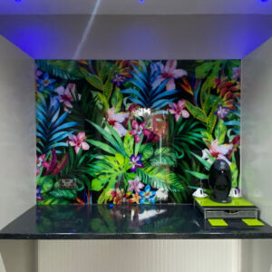
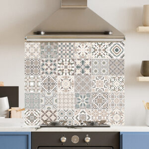
- Patterns and Motifs: Instead of a solid colour, you can opt for patterns that weave in complementary shades, offering visual depth.
- Accent Elements: If you’re not ready for a full complementary splashback, consider using the contrasting colour in kitchen accessories or smaller features.
Expert Tips
- Play with Tones: Complementary doesn’t mean the colours have to be at full intensity. You can play with tints (lighter versions) or shades (darker versions) to get the desired effect.
- Consider the Room’s Size: In smaller kitchens, using lighter tints can make space feel more expansive. Conversely, darker shades can lend a cosy feel to larger kitchens.
Conclusion
Colour systems, though initially seeming complex, are tools designed to simplify our choices. By understanding Dulux, Hex, and RAL, homeowners can make informed decisions, ensuring their kitchen splashback not only serves a functional purpose but also becomes a design highlight. Colour plays a pivotal role in shaping the atmosphere of any room, and the kitchen is no exception. By understanding and harnessing the power of complementary colours, homeowners can create spaces that are both functional and beautifully harmonised.
Glossary
- Colour Wheel: A circle with different coloured sectors used to show the relationship between colours.
- Tint: A shade or variety of colour; a slight trace of something.
- Neutralise: To make something ineffective or harmless.
- Palette: A range of colours available or used by an artist or designer.
- RGB: Stands for Red, Green, Blue. A colour model used in digital designs.
- Standardised: Made consistent across instances or samples.


