


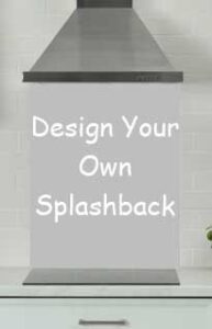
Elevate Your Kitchen’s Ambiance with Colour-Matched Splashbacks
Elevate Your Kitchen’s Ambiance with Colour-Matched Splashbacks
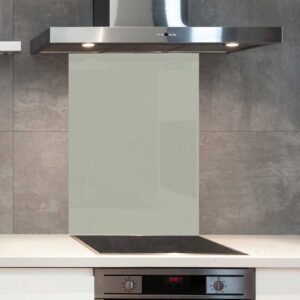 Colour is a potent tool in interior design. It can set a mood, influence perceptions, and even alter how we feel in a particular space. In the heart of the home – the kitchen – a well-chosen colour can uplift and inspire. One impactful way to introduce or enhance your kitchen’s colour palette is through a colour-matched splashback.
Understanding the Colour Wheel
Before diving into the benefits of colour-matched splashbacks, it’s vital to appreciate the basics of colour theory. The colour wheel, with its spectrum of hues, can be broken down into:
- Primary Colours: Red, blue, and yellow.
- Secondary Colours: Green, orange, and purple (created by mixing primary colours).
- Tertiary Colours: The result of mixing a primary and secondary colour, like red-orange or blue-green.
With this knowledge, you can make informed decisions about complementing or contrasting your existing kitchen palette.
The Value of Colour-Matching
- Seamless Integration: Colour-matching ensures that your splashback perfectly complements your kitchen’s existing shades, creating a harmonious and cohesive look.
- Mood Setting: Colours evoke emotions. Warm tones like reds or oranges can energise, while cool shades like blues and greens can introduce a calming ambiance.
- Visual Expansion: Lighter shades can make a space feel larger and brighter, while darker tones can add depth and drama.
Leveraging the Dulux, Hex, and RAL Systems
To achieve precise colour-matching, systems like Dulux, Hex, and RAL are invaluable. These systems provide a comprehensive range of shades, ensuring that your chosen colour for the splashback mirrors your desired palette accurately.
Bringing Your Vision to Life
With advanced printing technology at our disposal, achieving your dream hue has never been easier. Whether you wish to match the soft pastel shade of your cabinetry or contrast it with a bold and vibrant hue, the possibilities are endless.
Conclusion
Colour-matched splashbacks offer more than just protection for your walls; they are a canvas upon which you can paint your vision for your kitchen. In embracing the nuances of colour, you can transform a functional space into a delightful culinary haven.
Glossary
- Palette: A range of colours used or available for use in a visual design.
- Hue: A colour or shade.
- Tertiary Colours: Colours made by mixing equal amounts of primary and secondary colours.
- Ambiance: The character and atmosphere of a place.


